
Are you looking to get actionable insights for the upcoming marketing campaign from existing marketing data? You must create marketing dashboards on Power BI by following the simple steps mentioned in this article.
To make a killer marketing strategy, you might track various metrics like Click-Through Rate (CTR), Cost Per Click (CPC), Impressions, and so on. However, most digital marketers say that making sense of raw data accrued from a marketing campaign is challenging. It becomes more problematic when such marketing data are spread across different websites, hard drives, emails, etc.
It would be great if you could use data analytics software that allows you to consolidate all marketing data in one place. Also, it allows you to create a one-pager report with professional visualizations that your team members understand.
Here comes Power BI and its robust dashboard-making features. Read on to learn how to create a marketing dashboard in Power BI without holding a data science degree.
What Is a Marketing Dashboard?
A marketing dashboard is a comprehensive report of your marketing campaign’s performance. It uses various KPIs, metrics, charts, etc., to visually explain the health of the marketing scheme. It’s also a report that gives a bird’s eye view of your company’s marketing effort, and the general audience can easily understand the outcome of marketing campaigns.
Most dashboards connect to live and real-time datasets. As you receive more clicks on your PPC campaign or customers fill up lead generation forms, the figures automatically update on the dashboard.
You can also link channel-wise marketing performance in such dashboards to get a holistic view of the company’s marketing activities on various channels like websites, social media, mobile apps, etc.
Also read: KRA vs. KPI – Definition, Examples, and Why You Need Both
Why Do Businesses and Marketing Agencies Use a Marketing Dashboard?
Here’s why agencies and businesses use marketing dashboards, and you also should:
- Dashboards provide up-to-the-minute data about ongoing marketing campaigns so marketing managers can make changes to the schemes in response to evolving customer behaviors and market trends.
- Such data visualizations consolidate marketing metrics and KPIs in one screen so businesses and agencies can gain holistic insights.
- Marketing managers can craft effective marketing strategies and tactics when they get clear and readily accessible data on marketing dashboards.
- Such dashboards primarily display complex data with charts and maps so that audiences with any skill level can digest the report.
- Businesses and marketing agencies can easily monitor their progress toward marketing objectives.
- Dashboards offer a transparent view of marketing activities, fostering trust among stakeholders and clients.
- Marketing agencies often use dashboards to deliver detailed reports to clients, demonstrating the value and impact of their services.
Also read: How To Create a Sales Dashboard in Tableau
How Does a Marketing Dashboard Help With Competitive Analysis?
A Marketing Dashboard aids in competitive analysis by providing a compact view of key performance indicators (KPIs) and metrics. It allows businesses to compare their performance against competitors. Also, it enables the tracking of market share, engagement rates, and other relevant data, offering insights into the business’s rank in the market segment.
A data-driven perspective offered by marketing dashboards helps identify strengths and weaknesses relative to competitors. This fuels strategic adjustments of marketing campaigns at par with your rival businesses.
Moreover, historical data available on dashboards are helpful for trend analysis, consumer behavior pattern creation, etc. Finally, your marketing teams can respond to quick marketing cues and change marketing tactics to minimize cost, maximize conversions, and stay ahead of your competitors.
How To Create a Marketing Dashboard in Power BI
Creating a dashboard on Power BI is pretty straightforward. Everything added in the Report view of the Power BI canvas is part of the dashboard.
When compared with Tableau, you don’t need to create separate worksheets. In other words, when you import worksheet visualizations directly into the Tableau dashboards, it’s totally different in Power BI. You need to create the visualizations in the Report view by dragging and dropping fields from the Data pane on the right side of the app.
Find below a step-by-step guide:
Import a Digital/Web Marketing Dataset
Firstly, you need to connect your dataset to Power BI so you can build the dashboard using the data. Here’s how to import data:
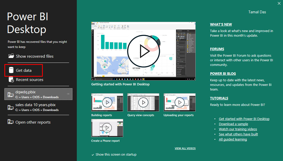
- Open Power BI.
- On the Power BI Desktop splash screen, click the Get data button.
- On the Get Data dialog, you’ll find data source categories on the left-side panel and exact file types or sources on the right-side panel.
- Since I’m importing a CSV file, I’m clicking File > Excel Workbook.

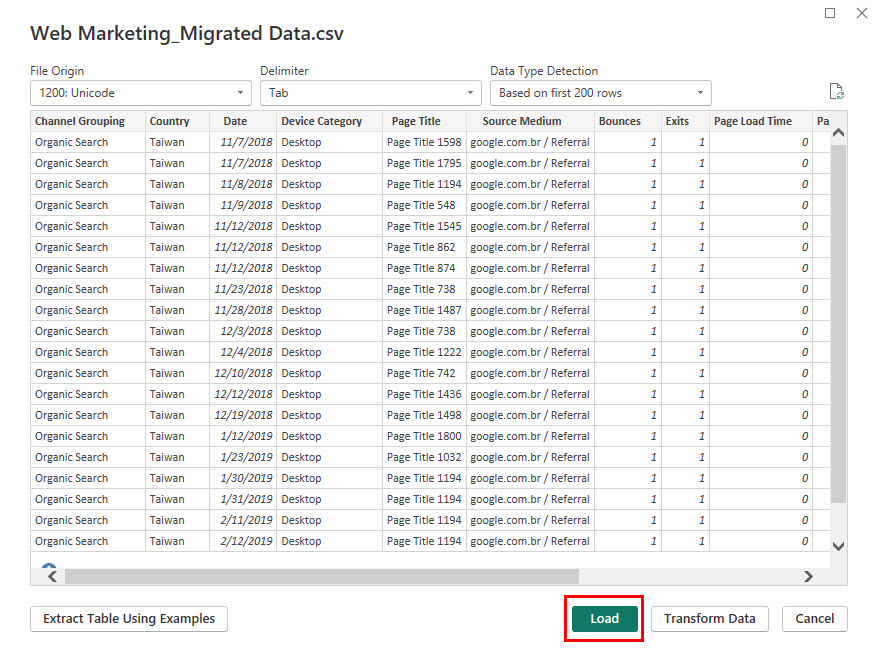
- Then, Power BI asks to navigate to the exact file upon clicking the Connect button.
- You should now see a preview of the dataset with two buttons: Load and Transform Data.
- If the structure of the preview shows that it isn’t organized the right way, click Transform Data to open Power Query.
- If you see the data is organized, simply click Load.
- Your dataset should be available in the Table view section.

Create a Basic Dashboard
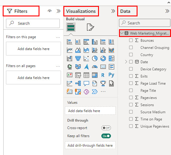
Report view is the canvas where all dashboard-making tasks take place. There are three right-side navigation panels on Report view. These are as follows with their features:
- Filters: Here you can add data fields to create filters.
- Visualizations: It contains the menu for data visualizations under the Build visual tab and all visualization and canvas formatting options under the Format page tab.
- Data: It contains the database you imported and shows a hierarchy of the dataset.
You must now go to the Report view section to start creating the foundation of the dashboard. Follow these steps:
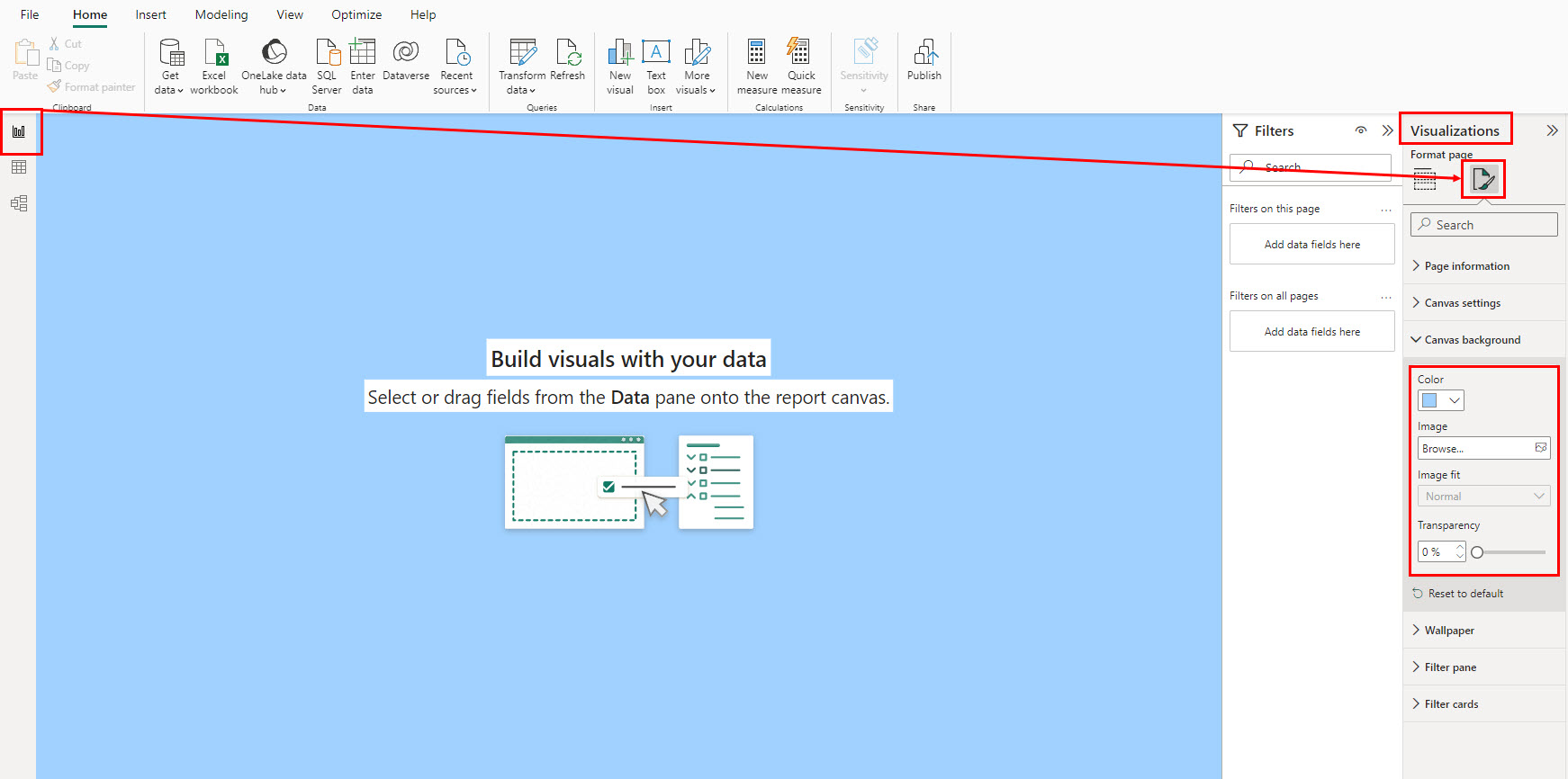
- On the Report view canvas, click the Format page tab under the Visualizations section.
- Expand the Canvas background menu and choose customizations for Color, Image, Image fit, and Transperency (must be zero if you’re just changing the color).
- Now, to add a title for the dashboard, go to the Insert tab in the Power BI ribbon menu.
- There, click on the Text box object inside the Elements commands block.
- Now, resize, add text, and format the content to meet the style you’re looking for.
- You can change various object properties like Effects, Background, Visual border, Shadow, etc., from Format > General on the right-side panel.

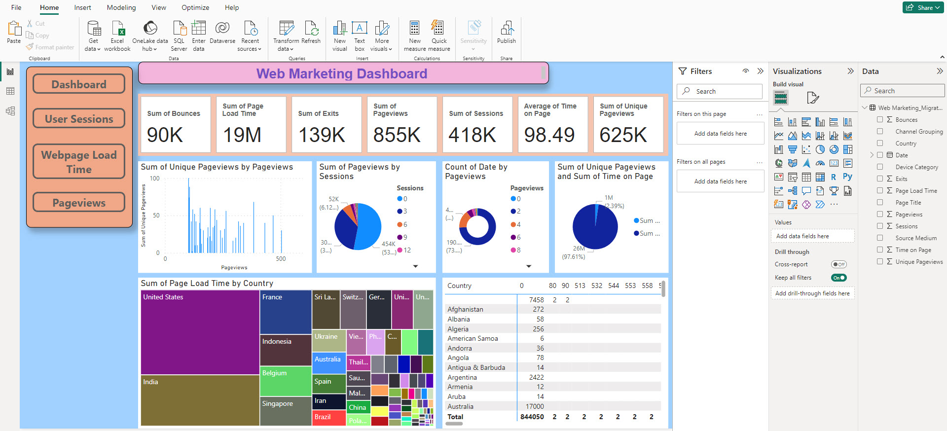
Here, you can also create a left-side navigation panel on the dashboard to redirect users to niche-specific reports with detailed data presentations. For example, I created redirect buttons for Dashboard, User Sessions, Webpage Load Time, and Pageviews.
Here’s how you can create interactive buttons:
- Click Insert > Buttons > Blank to add square-shaped buttons.
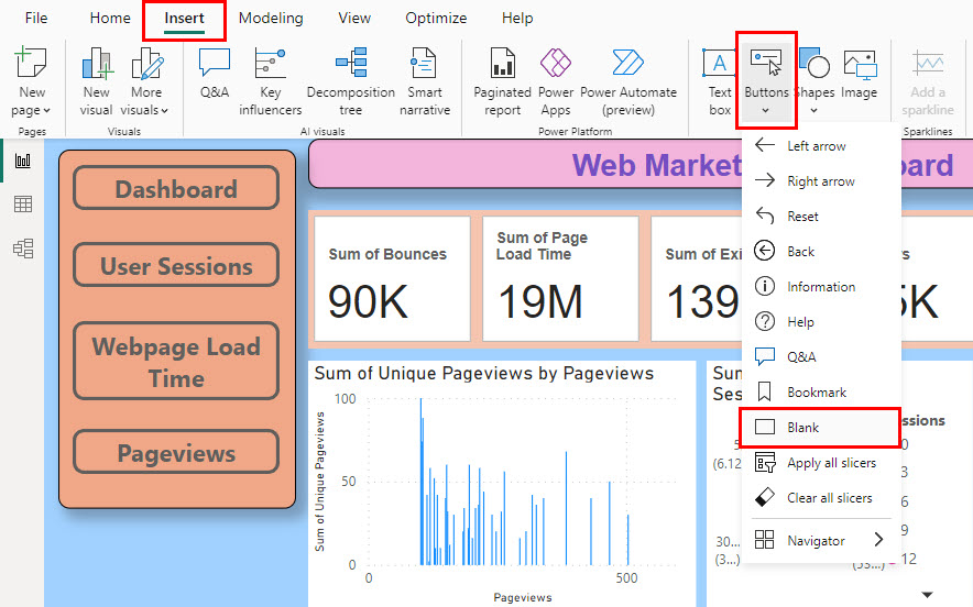
- Click on the button and go to Format > Button on the right-side panel to access formatting options, like Shape, Style, Border, etc.

- Now, activate the Actions menu for the button and select Page navigation under Type.
- Click the Destination drop-down and choose another canvas from the list, like User sessions, Webpage load, Pageviews, etc.
- You can now click Ctrl + the button to navigate to the linked report.
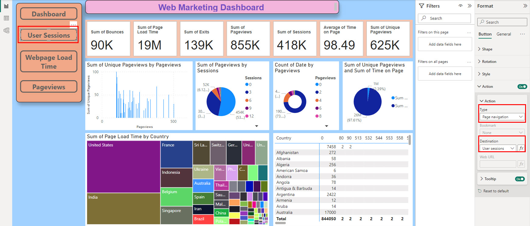
Find below the basic dashboard created so far:

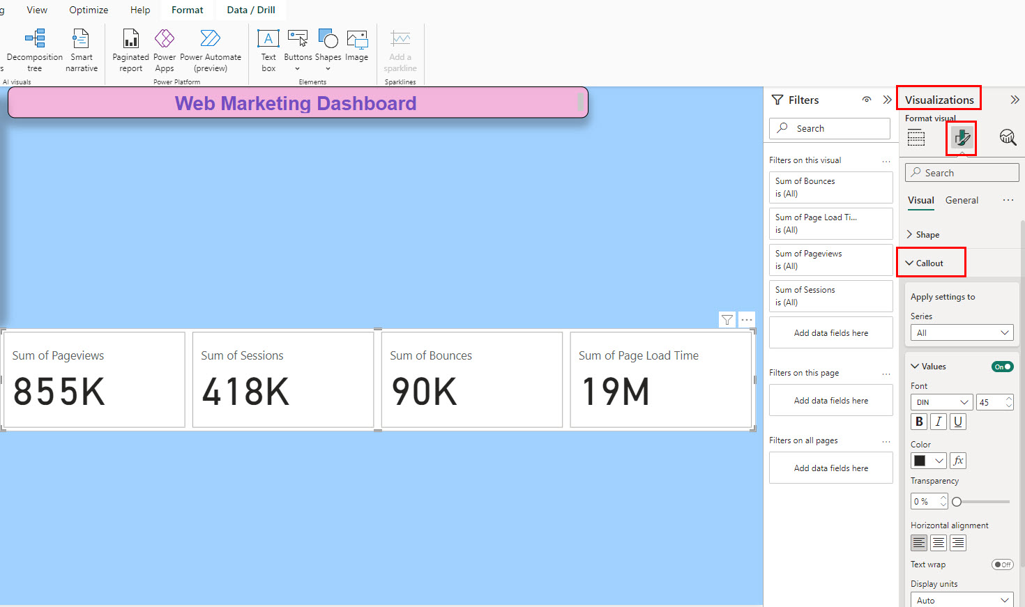
Add KPIs From the Dataset
Now, you can add KPIs and metrics by following these steps:
- On the Visualizations > Build visual tab, click Card (new) on the list of visualizations menu.
- Resize the card as needed.

- Now, you can add the metrics and KPIs by dragging and dropping data from the Data tab to Visualizations > Data.
- Keep adding more as needed.
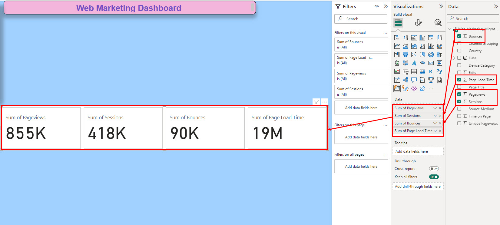
- Now, to format the metric boxes, Visualizations > Format visual > Callout.
Add Charts and Graphs to the Dashboard
Now, to visualize data by comparing between fields, like Bounce vs. Pageviews, Pageviews vs. Time on Page, and so on, you need to add charts. Here’s how:
- On Visualizations > Build visual, click Stacked column chart or any other chart you want.
- You should find options like X-axis, Y-axis, etc., on the Visualizations panel.
- Add data to the appropriate axes of the Stacked column chart object.
- This should automatically populate the visual.
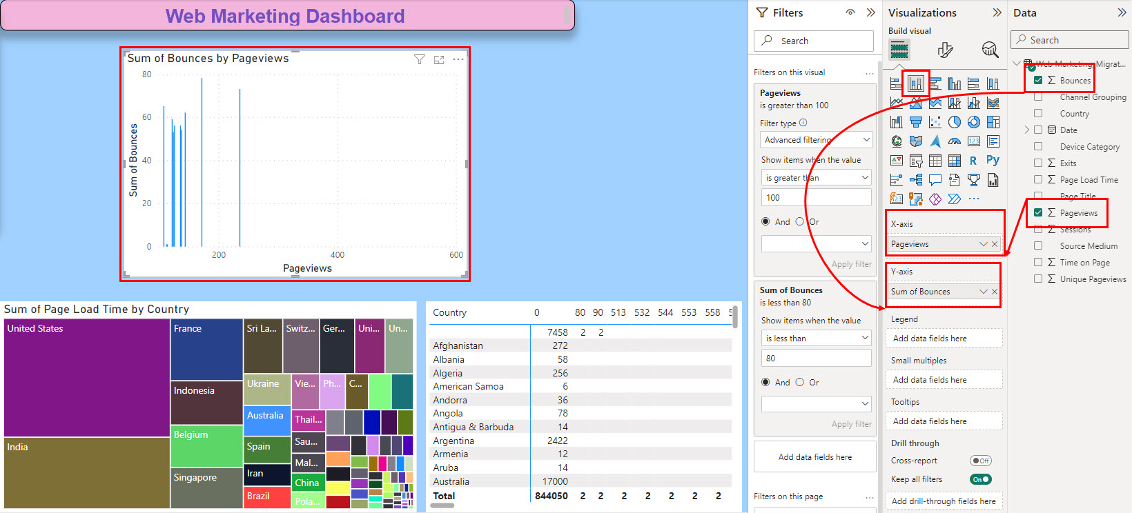
- You can adjust the scale of the visual by applying filters on the Filters navigation pane > Filters on this visual.
So, this is how you can add charts. You can add more charts like Pie charts, Donut charts, Guage charts, etc. You can also add maps like Treemap, Map, Field map, etc.
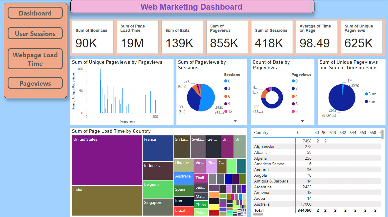
Find below the marketing dashboard after adding various data visualizations:
Publish or Export the Dashboard
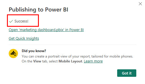
To publish the dashboard on your organization’s server, do the following:
- Click the Publish button on the Power BI ribbon menu.
- On the Publish to Power BI dialog, choose a destination and click Select.

- You should see the Success message.
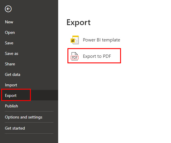
Another way to share the dashboard is by printing it as a PDF file from File > Export > Export to PDF.
Power BI Marketing Dashboard: Best Practices
Find below the best practices you should consider when creating dashboards on Power BI:
- Create a list of metrics and KPIs your business uses to measure the success rate of any marketing campaign. Then, include those in the Power BI report.
- Mostly, Power BI automatically organizes your data into a usable format, so you can simply drag and drop those into the charts of Power BI. However, you should also start with the cleanest database to make the dashboard-making process effortless.
- Place the most important metric in a large and visible object box and format it so the audience can easily locate it.
- Add filters, slicers, and drill-through features to allow users to explore the data and gain deeper insights.
- Keep the dashboard design intuitive and user-friendly, making it easy for users to understand the data.
- Maintain consistency in color schemes, fonts, and layouts to enhance the dashboard’s professionalism.
- Use appropriate charts and graphs to represent data, keeping it simple and meaningful.
- Implement proper security measures like data masking to safeguard sensitive marketing data.
Power BI Marketing Dashboard: Expert Tips
As a Power BI report-making expert, I suggest you implement these tips when creating a dashboard:
- Use incremental refresh for an extensively large dataset with live data adding up to the original database every second.
- To redirect viewers to a worksheet from the dashboard, use interactive buttons. You can easily add one from Insert and use the Page navigation action to make it clickable.
- Ensure there are appropriate data modeling relationships between the fields and tables of your dataset to leverage the Visual Interactions feature of Power BI.
- Use Data Analysis Expressions (DAX) to create custom measures that provide deeper insights, such as cumulative totals, rolling averages, and advanced calculations.
- Explore and leverage custom visuals from the Power BI marketplace to add unique and engaging elements to your dashboard.
- Create parameter tables to allow users to change specific aspects of the data, such as time frames or comparison periods, enhancing interactivity.
- Incorporate Power BI’s AI capabilities to automatically detect trends, anomalies, and other insights in your data, enhancing predictive analytics.
- Maintain version control of your dashboard to track changes and revert to previous versions if necessary.
Supermetrics as a Power BI Alternative

If Power BI seems a bit intricate to you, you can check out Supermetrics for all marketing reporting needs. It works as a no-code report builder and can connect to data sources from more than 100 platforms. I used it to collect data from my marketing projects on Facebook Ads, Google Ads, LinkedIn Ads, and Shopify.
I could easily build beautiful and data-packed dashboards by pulling data from these channels and superimposing the data on a Supermetrics dashboard template.
Then, I could also export my marketing data to top destinations like Google Sheets, Looker Studio, Amazon S3, Snowflake, etc. The result was quite satisfactory.
Author’s Note
There’s no other alternative for data-driven decision-making in online marketing than marketing dashboards. So, building such a dashboard shouldn’t be a challenge for any marketing personnel.
Power BI makes this process simple enough. You just import your raw data as a CSV or connect to a live marketing data server. Then, track the KPIs and metrics that matter the most for your business.
However, designing a winning dashboard prior to investing time in building one from scratch always pays out. There are various Power BI dashboard templates out there on the internet to get design inspiration.
You might also want to read about these best social media, analytics, and business data dashboard tools.
Was this article helpful?
Thank you for your feedback!